Continuing on the well-rooted tradition of analyzing charts, here I look yet again at one chart in particular.
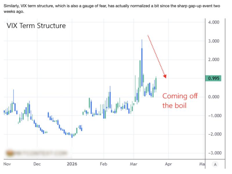
Here is the chart. I took it from an article on Zerohedge. I'm blurring out the reference to the author because I don't agree with him whatsoever. It's not that I don't want to send them traffic - I think that's irrelevant - but I don't want my readers to confuse a mention with an endorsement.
Furthermore, this specific author tends to write articles with titles like "as we predicted..." but the articles come out two days late, and there was no timely prediction - just a revisionist bragging after the fact. This alone makes me want to avoid that author.
And since I don't endorse the author of the chart, I am unwilling to mention them by name. Now, the chart that we'll be analyzing:
You may wish to look at it to form your own opionion before moving on. I'll give you a moment... Ready?
Now, we won't delve on the fact that the colors are suspect too much. I often invert the colors, or otherwise substitute colors on charts in order to remove, or emphasize, specific emotions. But something positive that's happening a lot, I won't mark it green, and instead mark it grey. On the chart above however, they substituted red with blue. I had to take a second reading to make sure I'm understanding the colors correctly... and so, here green means increase, blue means decrease. But it is not obvious at all. The choice of colors is poor here.
Now, for the actual problem I have with this image. The author is trolling himself, isn't he. I don't need any information other than the chart itself, to disprove his claim. Let's look at the red line. Where is it pointing to? The author wants you to believe that there is a trend from top downward, and he's pointing out the trend, with the arrow. You probably thought it obvious the first time you looked at this chart. But I have spent enough time doubting everything lately, and I've made enough decisions looking at numbers and avoiding charts, to say - the trend isn't there. The red arrow is wrong.
And also, this is VIX youo are looking at, above. VIX is manipulated and everyone knows that. They'll print whatever they need to be printing, and you'll be stuck with it. The only good way to measure volatility is if you do it yourself - but that's a much longer, much more technical conversation. In fact, my trading platform provides volatility metrics. I'm not saying we're 100% on point in our volatility measures, but we make a darn good try.
Now, let's talk about fundamental concepts without the chart, for a moment. And let's simplify the 4 data points of a day (open, high, low, close) into one: close. That's pretty standard, isn't it? Unless you have some precognition skills, unless the day ended, you can't really be looking at the day's close, or the day's range. And if you're making decisions mid-day, just make sure it doens't reverse on you and go deeply against your position - all in the same day.
So, let's assume we don't have precognition. Let's say we're looking at the close values for the days on the chart above. Now would the red line look like then?
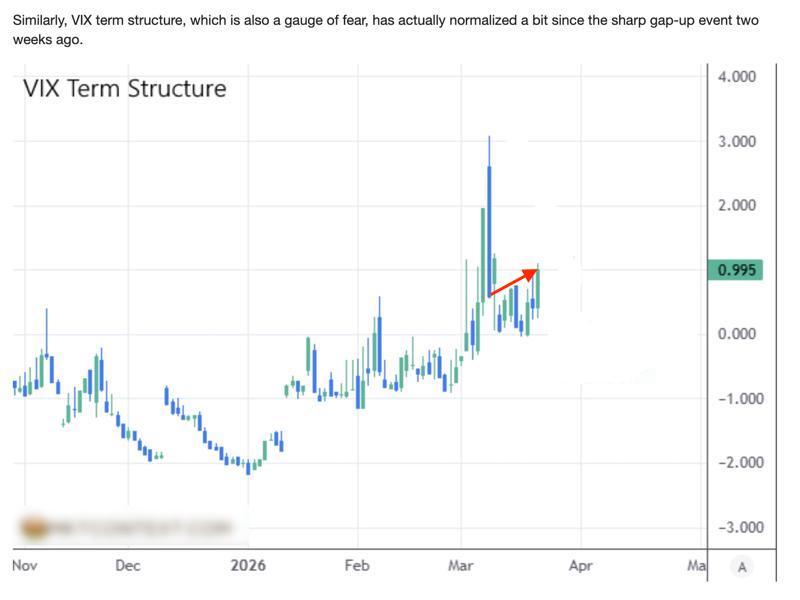
If I'm seeing correctly... the arrow is pointing up, not down. If you draw a line from "high" day's close, to last day's close... the trend is the exact opposite of what the original writer would have you believe.
What gives, what's going on? Should the arrow be pointing up or down? Shouldn't you have been... averaging? Should you believe strict numbers, or what a chart looks like, or what someone graws as an arrow on a chart?
Well, I'm not the one to give a correct analysis of this graph. I don't even look at VIX, neither daily nor monthly nor at all. I'm merely pointing out an incorrect analysis here, done by someone else. The minute I saw that arrow I thought, okay what's going on here, what now - and surely enough, the arrow contradicts even the graph on which it is drawn.
~ * ~ * ~ * ~
At Irowor Trading we are committed to providing a correct analysis of the data. Looking at the data in the right way is as important as having accurate data to begin with. And since there is a lot of money on the line, and some heavy decision-making, leveraging data tools in the right way becomes increasingly important.
Contact is for more info, or subscribe to a trial period to test-drive our platform!
.^.

A Complete Trading Strategy: Intro
Sat, 07/16/2022 - 10:07
Daily Charts: A quick correction to a polymarket graph
Tue, 03/31/2026 - 22:47
