...continuing our tradition of analyzing graphs, I bring you one more, this time from polymarket.

Here is the original chart:
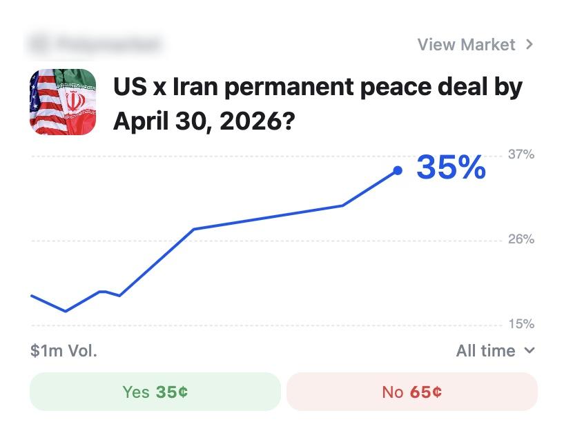
Of course, by now you should be thinking: okay, what is it now? I want to bring to your attention that although the graph allegedly shows probabilities within the dollar - so $0.35 assigned to Yes and $0.65 assigned to No - the graph range is between 15% and 37%. Not between 0% and 100%. Why would that be?
Perhaps a better question is: shouldn't you be looking at a graph of probabilities between 0 and 100, not some arbitrary number and some other arbitrary number? 37% isn't even the maximum on the chart, and 15% isn't the minimum. So the graph just pads 2% both high and low? Here is an adjusted graph, in the range 0-100:
 | 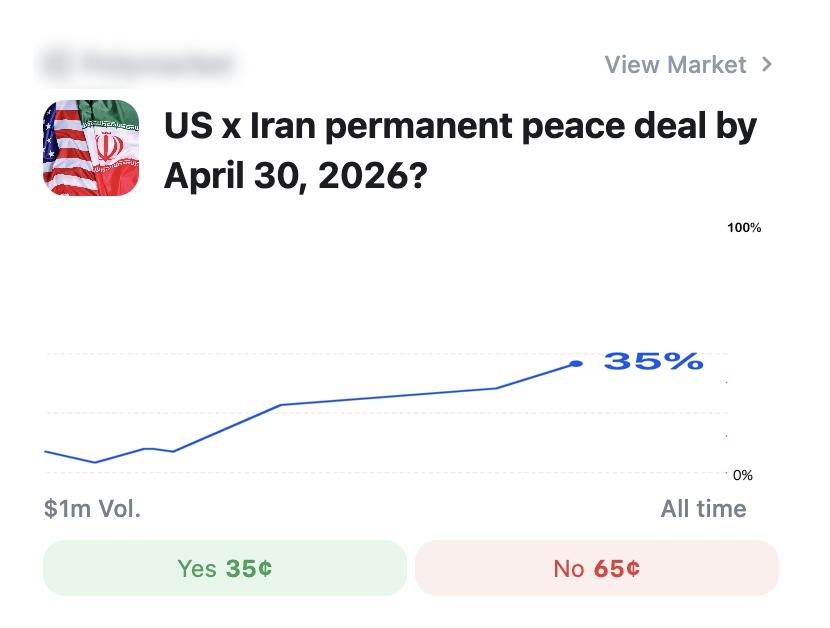 |
I'll let you decide which one is better. I'll let you decide which one you'd be betting your money on.

Daily Chart: a quick chart of VIX
बुध, 04/15/2026 - 20:02
Why my charts overlap and go out of their boundaries
शनि, 07/16/2022 - 09:58