As a preface, I need to mention that I don't have an implementation of a basic chart, thank you very much, and it is a very low priority for me. It used to be no-priority for me, but since I do look at a chart every once in a while and have noticed just how ugly and unreliable G charts are, how they change on you mid-second, how they... smooth?! the curve is smoothed? Is the price action smooth? No? Why is the squiggly line smooth then? So unfortunately I may have to implement my own basic chart. But regardless, for now I'm implementing things other than the basic chart.
I look at numbers. I can make decisions based on numbers, and I can automate those decisions. I cannot automate looking at a chart. And even if I can, that sounds like too much work, compared to looking at numbers and making decisions based on numbers.
And also, you look at a chart and you think you gain some knowledge, but you don't. If you know statistics and math and if you close your eyes and be honest with yourself, you'd say: at any point, even right now, the price action is as likely to go up as it is to go down. History of the price action be darned. And yeah, trend following statistically is profitable (I think), so if you look at a chart and say - dayum, that thing is going down - or dayum, that thing is going up - that may be valid decision-making input. But on the other hand, how may times have you looked at a chart and thought it's going somewhere and it's going the opposite way? How many times has a trend reversed and you were caught by that? How many times has the trend un-reversed and you got cought by that now, again, in a bull-trap or a bear-trap? And as importantly, just how many hours, days and months have you spent staring at the damn chart? And are you sure that you have something positive to show for it? Because I looked over the last 10 years of chart-watching for myself, and I'm not so sure it was useful at all. In fact, now and on my platform, I make it a point to not look at charts. I can make better decisions in silence, in darkness. It is correctness of decisions that I want. The chart only gets in the way.
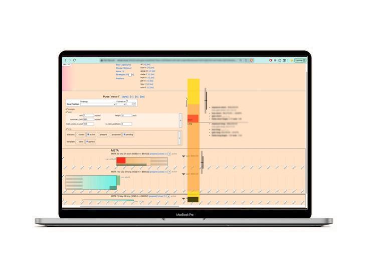
Luckily on my platform, I decide what there be, and what I want to see. I have other visualizations, other than price action. And my visuals are tailored to my strategies (which is not buy and hold, my strategies are short offensive). Let's discuss briefly my visualizations.
~ * ~ * ~ * ~
I think it's unreasonable to have a reasonable chart all the time.
Psychology is very important, and slight nudges, etc make all* the difference. If your position is blowing up, but the chart is not blowing up, you'd be thinking, oh it's not so bad, still within the boundaries... But then you look at a single number (position, down 95% overall) and... you should panic, but then you look at a mainstream chart which is already reasonable, and think oh it's not so bad.
-=--- footnotes
* - because humans can't think for themselves, now can they?
To avoid that, I let my charts blow up. If my position is blowing up, so should my chart. And if my position is way overextended, either long or short, my chart will be overextended, too. My chart will extend off the screen, you'll have to adjust one of the relative zooms to see it whole. And, I use both up-down and left-right axis, and so a vertical chart will overlap a horizontal one. That is by design. That is what I want to see.
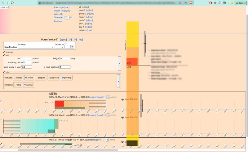
Additionally, there are multiple scaling settings that you as the user of the platform may adjust to make the charts more reasonable. The summary_unit (px/usd) is different from the main unit (px/usd) and so if the summary is blowing up, you can reduce its scale only. As well, the summary is collapsible so if you want to keep the scale to remind yourself that the position is blowing up, but don't want to look at it right this minute, you can just hide the summary with one click.
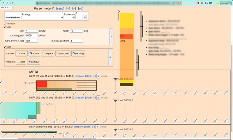
I have chosen so far to not adjust scales automatically. You have to adjust each scaling factor separately, per-purse, and the scale will not change unless you change it. I think this way I can have better clarity as to where things are going. If I adjust the scale, it's because I've noticed that things are going somewhere unexpectedly. The platform won't do it - so when things are going somewhere unexpectedly, you as the user will notice it, without the platform hiding it from you. Amazing. Revolutionary.
Daily Charts: A quick correction to a polymarket graph
Tue, 03/31/2026 - 22:47
A Complete Trading Strategy: Intro
Sat, 07/16/2022 - 10:07